4 min reading time
Introducing a Brand New LearnUpon

LearnUpon is in the midst of a revolution. Over the past 12 months, we’ve had tremendous growth, gained inspirational new customers, hired almost 100 new people, switched to remote-first working, and closed an impressive investment round. A lot has happened!
To reflect on these remarkable achievements, we felt it was time to create a new brand look and message for LearnUpon; one that mirrors who we, as a company, are today, and who we aspire to be tomorrow.
Now, we’re sharing why we decided it was time for a change, and giving you an in-depth look at a brand new LearnUpon. We believe we’re shaking up the corporate learning industry and we hope it inspires learning leaders, around the world, to push boundaries when it comes to delivering high-impact training for their businesses.
Time for something revolutionary
Since day one, LearnUpon has been through several brand refreshes. Some were just a new lick of paint, while others were a little more comprehensive. This time, however, we knew we wanted something revolutionary. Why? Well, the reason is twofold.
Firstly, as mentioned above, it’s been a time of growth and change within the company. I joined in the fall of 2019 as the Head of Marketing, and I’ve seen not only my team, but the whole business, accelerate in how we function, how we communicate, and the impact we are having.
Although we’ve always had a strong sense of self, with these advances, our company’s vision has become both more defined and more ambitious. So, it stands to reason that our brand should be bigger, brighter, better; it should be something that is sincerely us.
Secondly, over the past few months, we’ve been inspired by the corporate learning world.
From watching our incredible Learning Impact speakers to seeing our team adapt to remote working, to most importantly, hearing how our customers, our blog readers, and our audience of learning leaders, have adjusted and excelled with online training. We wanted a brand that reflected how inspired we are, and in turn, to inspire others too.
Modern, stylish, and simple
The LearnUpon logo has had a couple of iterations. With each one building on the last, we’ve always tried to make it better and better, however, we’ve never quite hit the nail on the head.
Now, that’s changed. Although subtle – more space, more roundness, two-toned and featuring our new blue – we believe we’ve finally landed on a logo that looks modern, stylish, and simple. It’s something we are proud to have on every document, website page, piece of content, and beyond.
Unlock the power of learning
At LearnUpon, we see learning as a secret weapon. In the past, it was viewed as a tick box exercise that an organization had to do. Now, it’s so much more, and we want to help businesses understand and utilize the impact of learning.

We wanted a confident, compelling tagline that let leaders know the secret is out – learning is their businesses number one competitive advantage. Thus, our new tagline was born: Unlock the power of learning with LearnUpon LMS.
The future is blue
Blue has always been at the heart of LearnUpon’s color scheme. Trustworthy and dependable, it represents who we are as a business. We wanted to maintain that, while also ensuring we have the right hue.
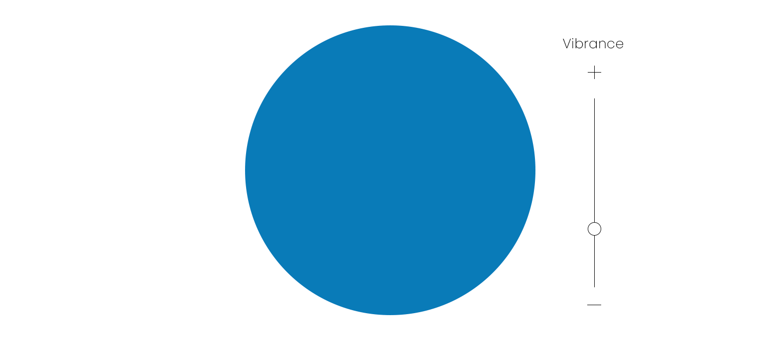
In the past, we’ve had a more muted, corporate blue, that although pleasant, didn’t represent the exciting company we are. So, we pivoted and discovered what our Design team affectionately nicknamed “Future Blue”. Fresh, vibrant, enthusiastic, this brighter shade reflects our new brand and the energetic team and customer-base behind it.
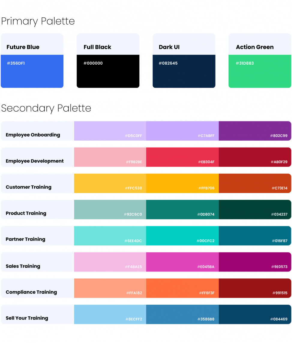
To complement “Future Blue”, our designer also created a primary and secondary palette filled with bright, lively colors that are uniquely LearnUpon.
Geometric and futuristic
Across our website, eBooks, slide decks, and more, we wanted to ensure that our words and images are coming across how we want them to – confident, inspiring, and connected. This means we needed consistent font and imagery that doesn’t compete with what we are saying, but rather emphasises it.
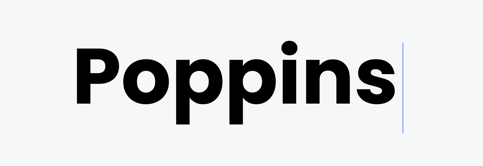

As our new tagline and color scheme was forward-looking, we knew our font and images had to fit this theme too. Choosing Poppins, a crisp, yet flexible typeface, and designing new (really awesome!) artwork, our Design team created a bold, geometric aesthetic that underpins our customers and team’s future-focused outlook on learning.
Showcasing our people
There are two sides to LearnUpon – our product and our people. For our new brand, we wanted to represent both equally. We are known for our best-in-class team. Our customers get to know us personally – they know our faces, and so it made sense to make our people part of our brand.
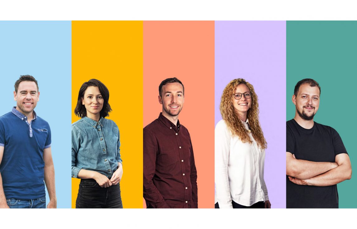
Dotted throughout our homepage and beyond, you’ll see the photographs of the LearnUpon team on colorful backgrounds. Friendly, casual, enthusiastic, and personable, we believe this represents our authentic selves and we hope it’s what our customers see too. 😀
New look, new message, but we’re still the same team and same product. LearnUpon strives everyday to help businesses around the world deliver impactful training that fuels growth. We’ve just upped our game with a new brand that reflects who we are as a business. Let us know what you think in the comments below.